

White balance is usually taught as a correction tool, but it can also be one of the easiest ways to shape the mood of a photograph. Instead of always trying to make whites look perfectly neutral, you can deliberately warm, cool, or tint the scene so the color supports the story.
Quick verdict: White balance is not just a correction setting. You can use it creatively by deliberately warming, cooling, or tinting an image to strengthen mood, guide attention, or make lighting feel more dramatic. Start with presets such as Daylight, Cloudy, Shade, Tungsten, and Fluorescent, then fine-tune Kelvin or tint while checking that important skin tones and key colors still look intentional.
The goal is not to make every photo look heavily stylized. The goal is to make a conscious color choice. A cold blue street scene, a warm family dinner, or a magenta-tinted neon portrait can all feel more expressive when white balance is used with intent.
How To Use White Balance Creatively
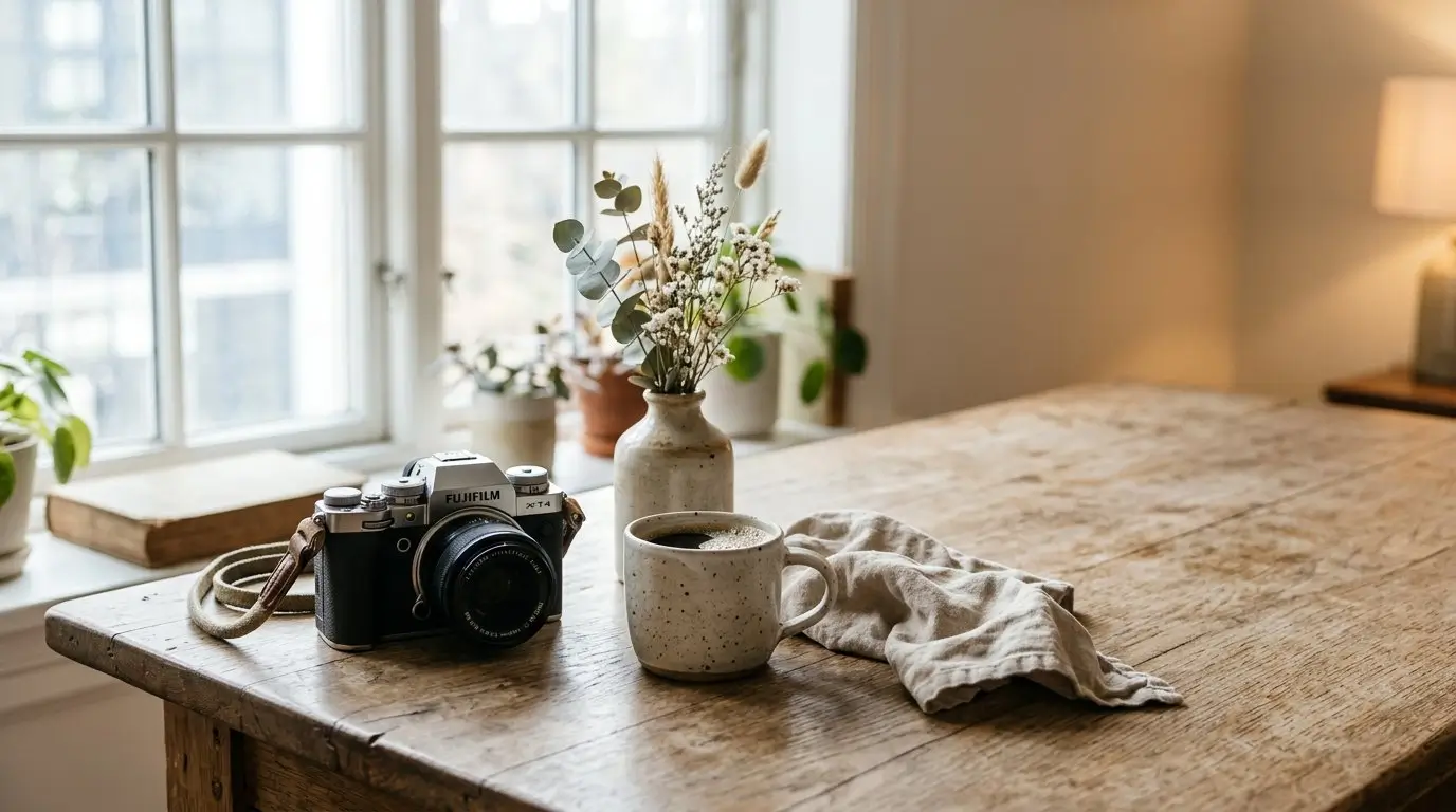
Using white balance as a creative tool means choosing a color temperature for mood instead of choosing one only for technical accuracy. A “correct” white balance neutralizes the color of the light. A creative white balance may exaggerate that color, reduce it only partly, or shift it in a direction that better matches the feeling you want.
The basic rule is simple:
- Warmer white balance choices add more yellow, orange, or amber feeling.
- Cooler white balance choices add more blue feeling.
- Tint adjustments move the image toward green or magenta.
For example, a cool white balance can make a winter landscape feel quiet, distant, or lonely. A warm white balance can make a sunset, candlelit room, or cozy interior feel more inviting. A tint shift toward magenta or green can make artificial light feel more stylized, especially around LEDs, fluorescent tubes, neon signs, or city lighting.
A simple creative white balance process looks like this:
- Set your exposure first. White balance changes color, not brightness.
- Choose the mood. Decide if the image should feel warm, cold, natural, tense, nostalgic, or surreal.
- Select a preset or Kelvin value. Start with Daylight, Cloudy, Shade, Tungsten, Fluorescent, or a manual Kelvin setting.
- Review the image. Look at skin, whites, shadows, highlights, and the subject.
- Refine the setting. Adjust Kelvin or tint until the color feels intentional.
You can do this in-camera, during editing, or both. If you shoot RAW, you have much more flexibility to refine temperature and tint later without being locked into the camera’s original white balance. If you shoot JPEG, it is still possible to adjust color afterward, but the file gives you less room to make big changes cleanly.
The most important shift is mental: stop asking only, “Is this white balance accurate?” and start asking, “Does this color help the photo?”
What You Need Before You Start
You do not need special lighting gear to experiment with creative white balance. You only need a camera or phone that gives you some control over white balance and a scene where color mood matters.
Helpful items include:
- A camera or phone with white balance controls
- RAW capture, if available
- A scene with a clear light source, such as window light, sunset, shade, lamps, or streetlights
- A gray card or white object, optional but useful for comparison
- A screen or viewfinder preview, especially on mirrorless cameras and phones
- Editing software or an app with temperature and tint controls, if you want to refine later
Most cameras offer several white balance options. The names vary by brand, but you will usually see some combination of:
- Auto White Balance
- Daylight or Sunny
- Cloudy
- Shade
- Tungsten or Incandescent
- Fluorescent
- Flash
- Custom White Balance
- Kelvin temperature
- White balance shift or tint
The exact menu path is not important. What matters is understanding the function. Presets are quick creative starting points. Kelvin gives finer temperature control. Tint or white balance shift helps correct or exaggerate green and magenta color casts.
When learning, a useful setup is RAW plus JPEG. The JPEG shows you the creative white balance choice immediately, which helps you learn how the setting affects the image. The RAW file gives you flexibility if you decide later that the effect was too strong or not strong enough.
If your camera has live view or an electronic viewfinder, turn it on and watch the color change as you adjust white balance. If your camera does not preview the effect clearly, take test shots and compare them. Phone cameras with manual or pro modes can also be excellent for learning because the preview often updates instantly.
A gray card or white object is not required for creative work, but it gives you a neutral reference. You can shoot one accurate version, then compare your creative versions against it. The point is not always to choose the neutral photo. The point is to understand how far you moved away from neutral and whether that movement improves the image.
White Balance Settings And Their Creative Effects
White balance presets are designed to correct different types of light. However, when you use a preset under a different lighting condition, it can create a strong creative color shift.
For example, Tungsten is meant to correct warm indoor bulbs by adding blue. If you use Tungsten outdoors in daylight, the photo can become dramatically blue. Shade is designed to warm up cool shade. If you use Shade during golden hour, the scene can become extra warm and glowing. Daylight under tungsten bulbs may keep the warm indoor ambience instead of neutralizing it.
Kelvin values are useful, but do not treat them as rigid formulas. Different cameras, lights, and scenes respond differently. Use the numbers as a guide, then judge the image.
| Setting or Kelvin Range | Typical Correction Use | Creative Effect | Good Subjects |
|---|---|---|---|
| Auto WB | General correction in changing light | Often neutral; may reduce strong color mood | Events, quick shooting, reference shots |
| Daylight / Sunny | Neutralizing direct daylight | Keeps warm indoor light or golden light visible | Sunsets, interiors, travel scenes |
| Cloudy | Warming cool overcast light | Adds gentle warmth and softness | Portraits, landscapes, lifestyle images |
| Shade | Strong warming for blue shade | Creates rich amber warmth | Golden hour, cozy scenes, autumn color |
| Tungsten / Incandescent | Correcting warm bulbs | Makes daylight scenes blue and cool | Winter, night mood, dramatic street scenes |
| Fluorescent | Correcting greenish artificial light | Can add magenta or unusual stylized color | Urban scenes, interiors, creative portraits |
| Flash | Balancing electronic flash | Slight warming or neutral flash color | Portraits, events, fill flash |
| Custom Kelvin | Manual temperature control | Precise warm or cool adjustment | Any scene needing fine control |
Temperature is only half the story. Tint controls the green-to-magenta axis. This is especially useful under fluorescent lights, mixed LEDs, neon signs, stage lighting, and some indoor environments where the image may look strangely green or overly magenta.
For natural-looking images, tint can help clean up unpleasant color casts. For creative images, tint can push the atmosphere. A slight magenta shift might make a night portrait feel more cinematic. A greenish cast might suit a gritty urban scene. These choices are subjective, but they should still feel deliberate.
A good habit is to start with a preset, then fine-tune with Kelvin or tint only if needed. Presets are fast and easy to understand. Manual controls are better when the preset is close but not quite right.
Step-By-Step: Creating A Mood With White Balance
Creative white balance works best when you make the color decision before you start adjusting randomly. Use this step-by-step process for portraits, landscapes, street scenes, interiors, and night photography.
1. Decide the emotional goal
Before changing the setting, decide what the photo should feel like. A portrait might need warmth and closeness. A city street might need coolness and isolation. A landscape might need natural color, while a foggy morning scene might benefit from a cooler tone.
Choose a simple mood word:
- Calm
- Warm
- Cold
- Tense
- Nostalgic
- Clean
- Dreamy
- Dramatic
- Artificial
- Natural
This decision prevents random color changes. It also helps you judge whether the final image works.
2. Identify the dominant light source
Look at the light before choosing white balance. Is the scene lit by sun, shade, cloudy sky, window light, lamps, flash, neon, fluorescent tubes, or mixed sources?
Then decide whether you want to neutralize that light or emphasize it.
For example, a room lit by warm lamps can be corrected until the walls look neutral, but that may remove the cozy atmosphere. Choosing Daylight or a slightly warm Kelvin setting can preserve the warmth. On the other hand, a product photo under the same light may need more accurate color, so a neutral white balance is a better choice.
3. Take a neutral reference shot
Start with Auto WB or a gray card shot. This gives you a baseline. You may not use the neutral version, but it helps you see what your creative setting is doing.
A reference shot is especially helpful when the scene is important, such as a portrait session, travel scene, interior shoot, or event. It also gives you a safe editing option if you later decide the creative color was too strong.
If you shoot RAW, the reference is even more useful because you can copy or compare settings during editing.
4. Choose a creative direction
Now pick a color direction based on the mood.
Use warmer white balance when you want:
- Comfort
- Glow
- Romance
- Nostalgia
- Sunset warmth
- Cozy indoor atmosphere
Use cooler white balance when you want:
- Quiet
- Distance
- Winter feeling
- Night mood
- Drama
- Clean minimalism
Use tint shifts when the scene has artificial color or needs a more stylized look:
- Magenta can reduce green casts or add a neon-like mood.
- Green can create an uneasy or gritty feel when used carefully.
- Small tint changes often work better than extreme ones.
For portraits, warmth often flatters the overall atmosphere, but too much orange can make skin look unnatural. For landscapes, cool tones can suit mist, snow, or twilight, while warmth can strengthen sunrise and sunset scenes. For street photography, white balance can help separate the feeling of daylight, sodium lamps, shop windows, and LED signs.
5. Adjust with presets first
Presets are the fastest way to learn creative white balance because each one creates a visible shift.
Try this quick sequence on the same scene:
- Auto WB
- Daylight
- Cloudy
- Shade
- Tungsten
In daylight, Tungsten will usually make the image much cooler. Shade will usually make it much warmer. Cloudy often gives a moderate warming effect. Daylight may keep the scene closer to what you saw.
Once you understand the look, switch to Kelvin if your camera allows it. A higher Kelvin setting generally makes the image warmer in-camera, while a lower Kelvin setting generally makes it cooler. Move gradually and watch the preview or test shots.
6. Check the important parts of the image
Creative white balance should look intentional, not like a mistake. Before continuing, check:
- Skin tones: Do people still look believable for the style?
- Whites and grays: Do they look intentionally warm, cool, or tinted?
- Highlights: Are bright areas turning muddy orange, harsh blue, or strange green?
- Shadows: Is the color adding mood or just making details unpleasant?
- Subject clarity: Does the color help the subject stand out?
In a portrait, the background can be very warm or cool, but the face still needs to feel considered. In a landscape, the snow can be blue for atmosphere, but it should not look accidentally mis-set unless that is the style you want.
7. Shoot a short white balance bracket
When the scene matters, shoot a few variations. You do not need dozens. A simple bracket might include:
- Neutral or Auto WB
- Slightly warmer
- Strongly warmer
- Slightly cooler
- Strongly cooler
For night photography, you might also bracket tint because artificial lights can shift green or magenta. For interiors, try one version that preserves the warmth of lamps and one version that is more neutral.
This gives you options later and trains your eye quickly. After a while, you will start to recognize which white balance direction suits each type of light.
Applying the process to common subjects
For portraits, start with believable skin, then decide how much warmth or coolness the mood can handle. A warm white balance can suit family, lifestyle, and golden-hour portraits. A cooler setting can work for fashion, editorial, or moody window light.
For landscapes, match the white balance to the atmosphere. Cool settings can enhance fog, snow, twilight, and stormy weather. Warm settings can bring out sunrise, sunset, desert light, and autumn scenes.
For street photography, use white balance to emphasize the character of the light. Daylight under warm shop lights can preserve urban glow. Tungsten outdoors can create a cold, graphic blue look.
For interiors, decide whether the room should feel accurate or atmospheric. Real estate and product work may need more neutral color. Lifestyle interiors can often benefit from warmth.
For night photography, experiment with both temperature and tint. Streetlights, signs, headlights, and LEDs rarely match each other, so a fully neutral image may not be possible or even desirable.
Common Mistakes And How To Avoid Them
Creative white balance is simple, but it is also easy to overdo. These are the most common mistakes to watch for.
Pushing warmth too far
Warmth can make a photo feel inviting, but too much can turn highlights orange, flatten subtle colors, or make skin look unnatural. If the whole frame looks like it has the same heavy orange layer, reduce the warmth or add contrast through composition and light instead.
A good test is to look at neutral objects. If white shirts, clouds, walls, or eyes look muddy rather than intentionally warm, pull back slightly.
Making every image in a set a different color
A single creative image can have a strong white balance. A series needs consistency unless the color changes are part of the story.
If you are photographing an event, trip, portrait session, or editorial sequence, avoid giving every frame a different color temperature. Choose a general direction and refine from there. Consistency makes the set feel more polished and easier to view.
Trusting only the rear LCD
Camera screens can be misleading, especially in bright sunlight or dark environments. A photo that looks warm and rich on the rear screen may look too orange on a larger display.
Use the screen as a guide, but do not rely on it completely. If possible, check the image in a shaded area, review it later on another screen, or shoot RAW so you can refine the choice.
Ignoring mixed light
Mixed lighting is one of the biggest challenges. A room may have daylight from a window, warm lamps, greenish LEDs, and a blue TV screen. One white balance setting cannot make every part neutral.
Instead of fighting all the colors, decide which light matters most. Balance for the subject, then let the background lights remain warm, cool, or tinted if they add atmosphere.
Trying to fix other problems with white balance
White balance cannot repair weak composition, poor timing, bad focus, or uninteresting light. It can strengthen mood, but it cannot replace the foundations of a good image.
Set exposure and composition first. Then use white balance to support the subject and story.
Styling when accuracy matters more
Creative color is not always the right choice. Product photography, artwork reproduction, some documentary work, and certain event images may require accurate color. If a client, record, or object depends on faithful color, start with a neutral white balance and use creative shifts carefully, if at all.
Troubleshooting And Checking Your Results
When a creative white balance does not work, the problem is usually easy to diagnose. Use these quick fixes to bring the image back under control.
If the image looks too orange
Reduce the warmth by choosing a cooler preset or lowering the Kelvin value. Check skin and highlights first. If the warmth is only too strong in one area, the issue may be mixed light rather than overall white balance.
If the image looks too blue
Choose a warmer preset, such as Cloudy or Shade, or raise the Kelvin value. Blue can be beautiful in snow, shade, and night scenes, but it should still support the subject. If faces look lifeless or the main subject disappears, add warmth back.
If the image looks too green
Adjust tint toward magenta. Green casts often appear under fluorescent lights, some LEDs, or reflected light from grass and walls. A small tint change may be enough.
If the image looks too magenta
Move tint back toward green or reduce the stylized effect. Magenta can look creative in neon or night scenes, but it can quickly become distracting in skin and neutral surfaces.
If a series looks inconsistent
Pick one reference image and match the rest to it. In RAW editing, synchronize or copy white balance settings as a starting point, then adjust individual frames only when the light changes.
Do not automatically choose the neutral version just because it is technically accurate. Compare the creative version against the neutral reference and ask which one better serves the photograph.
Use this result check:
- Does the color support the mood?
- Are important skin tones believable for the style?
- Do whites and grays look intentionally shifted?
- Is the subject still clear?
- Does the image fit with the rest of the series?
- Would the color choice make sense to someone who did not see your settings?
If you shoot RAW, use the temperature and tint sliders to refine the idea you started in-camera. If you shoot JPEG, keep adjustments smaller because large white balance changes can degrade color more quickly.
A useful long-term habit is to build a small personal reference set. Save examples of your favorite warm portraits, cool city nights, natural daylight landscapes, and stylized artificial-light images. Over time, this becomes your own visual guide for choosing white balance.
For practice, photograph the same scene with Auto, Daylight, Shade, and Tungsten. Do not judge by accuracy alone. Choose the version that best matches the mood you wanted before you started.
FAQ
Is it better to set creative white balance in-camera or edit it later?
Both work. Setting it in-camera helps you see and compose for the mood immediately. Editing later gives more flexibility, especially with RAW files. A good approach is to choose a creative direction in-camera, then fine-tune temperature and tint during editing.
What white balance setting makes photos look warmer?
Cloudy and Shade usually make photos look warmer because they add yellow or amber tones to compensate for cool light. You can also use a higher Kelvin value if your camera offers manual Kelvin control.
What white balance setting makes daylight photos look blue?
Tungsten or Incandescent white balance usually makes daylight scenes look blue because it is designed to correct very warm indoor bulbs. Used outdoors, it can create a cool, dramatic effect.
Can I use creative white balance for portraits?
Yes, but watch skin tones carefully. Warmth can make portraits feel inviting, while cooler tones can create drama or calm. The key is making the color look intentional while keeping the person believable within the style of the image.
Does shooting RAW matter for creative white balance?
RAW is very helpful because you can change temperature and tint later with much more flexibility. JPEG can still work, especially if you get close in-camera, but large white balance changes are more limited after capture.