
Good photo editing is not about making every image dramatic. It is about helping the photo look closer to what you intended when you pressed the shutter. The best edits usually fix distractions, guide the viewer’s eye, and improve tone and color without making the image feel artificial.
The most useful must know editing tips are simple: crop with purpose, correct exposure first, protect highlights, balance contrast, adjust color carefully, use local edits to guide attention, remove small distractions, sharpen at the end, and compare your edit against the original before exporting. If you build your workflow in that order, your images will improve faster and look more natural.
Quick Answer

The main takeaway: edit from big changes to small changes. Start with composition and exposure, then move into contrast, color, local adjustments, cleanup, sharpening, and export. This order prevents beginners from wasting time fixing details before the image’s foundation is right.
Here are the must know editing tips every beginner should learn:
- Crop before you fine-tune. Remove empty space, straighten horizons, and make the subject easier to notice.
- Fix exposure before color. A photo that is too dark or too bright will make color edits harder to judge.
- Protect highlights and shadows. Recover detail where possible, but avoid flattening the image completely.
- Use contrast with control. Contrast adds depth, but too much can crush shadows or make skin look harsh.
- Set white balance early. Correct color temperature before adding creative color.
- Use saturation lightly. Vibrance is often safer than saturation because it protects already-strong colors.
- Apply local edits. Brighten faces, darken edges, or soften distracting areas instead of changing the whole photo.
- Remove distractions. Small spots, dust, background clutter, and edge distractions can weaken an otherwise strong image.
- Sharpen last. Sharpening should support detail, not create crunchy outlines.
- Review before exporting. Compare before and after, zoom out, and check whether the edit still feels believable.
Think of editing as visual decision-making. Every slider should answer a question: does this help the viewer see the subject more clearly?
How to Think About This Topic
A helpful mental model for photo editing is to imagine building a house. Composition and exposure are the foundation. Contrast and color are the walls and lighting. Local edits and cleanup are the finishing work. Sharpening and export are the final inspection. If the foundation is weak, small finishing touches will not save the image.
That is why the order of edits matters. Many beginners jump straight to presets, saturation, or sharpening because those changes look exciting. The problem is that strong effects can hide basic issues instead of solving them. A sunset photo may look colorful after a preset, but if the horizon is crooked, the highlights are blown out, and the foreground is muddy, the image still feels unfinished.
Start by asking three questions:
- What is the subject?
- What is distracting from it?
- What mood should the edit support?
For a portrait, the subject is usually the person’s face, so your edit should support skin tone, eye contact, and clean background separation. For a landscape, the subject might be light, shape, atmosphere, or scale. For a street photo, the subject may be a gesture or moment, so contrast and cropping may matter more than perfect color.
This approach keeps must know editing tips practical rather than random. Instead of moving sliders until something looks “cool,” you make choices based on purpose.
A simple editing flow looks like this:
| Editing step | What to check | Practical example |
|---|---|---|
| Crop and straighten | Framing, horizon, edge clutter | Remove a bright object at the edge of a travel photo |
| Exposure | Overall brightness | Lift a dark portrait without blowing out the sky |
| Contrast and tone | Depth and detail | Add contrast to a flat cloudy landscape |
| White balance and color | Natural or creative color | Warm up indoor skin tones that look too blue |
| Local edits | Viewer attention | Brighten the subject’s face slightly |
| Cleanup and finish | Distractions, sharpness, export | Remove dust spots and sharpen for web use |
The goal is not to make every photo perfectly realistic. Some images should be moody, bright, soft, dark, colorful, or muted. The goal is control. A good edit looks intentional. A weak edit often looks like every slider was pushed without a plan.
Also remember that subtle does not mean boring. Small changes can have a large effect when they are targeted. A slight crop, a half-stop exposure lift, a warmer white balance, and a gentle local adjustment on the subject can transform a photo without making it look processed.
Practical Guidance
1. Crop and Straighten First
Cropping decides what the viewer sees and what they ignore. Before changing color or contrast, remove distractions around the edges, straighten tilted horizons, and improve the subject’s placement.
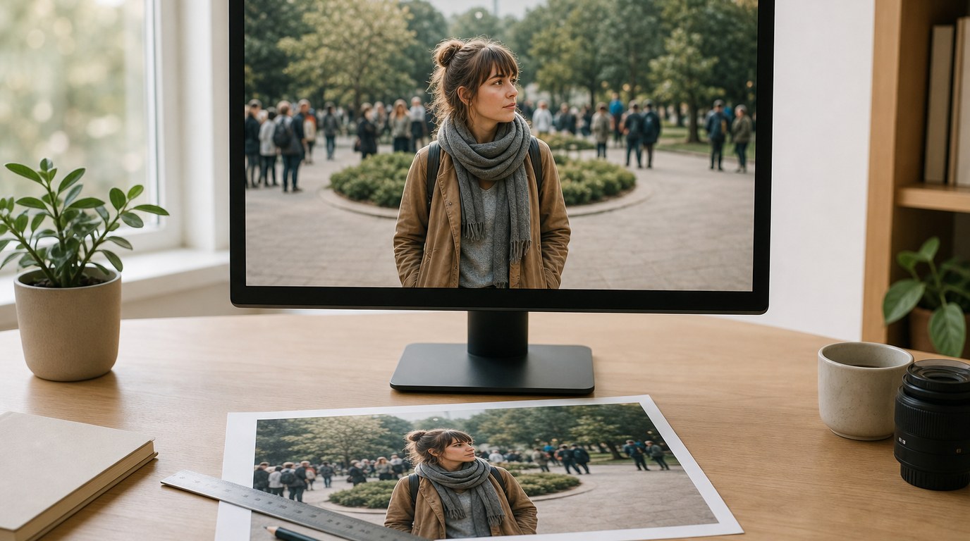
For example, if you photographed a person in a busy park, crop out half-visible people at the edge of the frame. If you shot a seascape, straighten the horizon before judging the rest of the edit. A crooked photo can feel amateur even if the colors are beautiful.
2. Correct Exposure Before Creative Edits
Exposure controls the overall brightness of the image. If the photo is too dark, colors may look muddy. If it is too bright, highlights may lose detail. Adjust exposure until the main subject feels readable.
For a backlit portrait, you might raise exposure or shadows so the face is visible, then reduce highlights to keep the background from becoming too bright. Do this before adding contrast or saturation.
3. Recover Detail, but Keep Depth
Highlight and shadow sliders are useful, but they can be overused. Pulling highlights down can recover sky detail. Raising shadows can reveal dark areas. However, if you recover everything equally, the image may look flat.
A good rule: recover important detail, not all detail. In a landscape, saving cloud texture may matter. In a dramatic portrait, deep shadows may be part of the mood.
4. Use Contrast to Shape the Image
Contrast makes bright areas brighter and dark areas darker. It adds punch and separation. But heavy contrast can make skin look rough, shadows too black, and highlights too harsh.
If the photo looks flat, add a small amount of contrast or use a tone curve. For portraits, be gentle. For architecture, black-and-white, or dramatic landscapes, stronger contrast may work better.
5. Set White Balance Before Adjusting Color
White balance controls whether the image feels warm, cool, green, or magenta. It should usually be corrected before you change saturation or color grading.
For indoor photos under warm lights, skin may look orange. Cooling the temperature slightly can help. In shade, photos often look blue, so warming the image can make it feel more natural. If skin tones look wrong, fix white balance before trying creative color styles.
6. Choose Vibrance Over Heavy Saturation
Saturation increases all colors equally. Vibrance usually boosts weaker colors more than already-strong colors, making it safer for beginners.
For a travel photo, a small vibrance boost can make the scene feel lively. But pushing saturation too far can make skies neon blue and grass unnatural. If a color becomes the first thing you notice instead of the subject, the edit may be too strong.
7. Use Local Adjustments to Guide Attention
Global edits affect the whole photo. Local edits affect only part of it. This is where many images improve dramatically.
You can brighten a face, darken a bright corner, add contrast to the subject, soften a distracting background, or add a subtle vignette. For example, in a portrait, lifting exposure on the face by a small amount can guide the viewer’s eye without changing the whole scene.
8. Clean up Small Distractions
Distractions are often small: dust spots in the sky, a bright sign behind someone’s head, a stray hair, or a piece of trash on the ground. Use healing or clone tools carefully to remove anything that pulls attention away from the subject.
Do not over-clean every texture. Skin, fabric, streets, and landscapes should still look real. Remove distractions, not character.
9. Sharpen at the End
Sharpening improves perceived detail, but it should be one of the final steps. If you sharpen too early, later edits may exaggerate noise or halos.
Zoom in to check important areas like eyes, text, or fine landscape details. Then zoom back out. If the image only looks sharp at 100% but harsh at normal viewing size, reduce the sharpening.
10. Review the Edit with Fresh Eyes
Before exporting, compare the edited photo with the original. Ask whether the subject is clearer, the mood is stronger, and the image still feels natural for its style.
A useful beginner trick is to step away for a few minutes, then return and view the image smaller on screen. Overdone edits often reveal themselves when you stop staring at individual sliders and judge the whole photo.
FAQ
What Should a Beginner Know First About Must Know Editing Tips?
A beginner should know that editing works best in a clear order. Start with crop and exposure, then adjust contrast, color, local details, cleanup, and sharpening. This keeps the image natural and prevents you from overprocessing small details before fixing the main problems.
What Matters Most When Evaluating Must Know Editing Tips?
The most important question is whether the edit improves the photo’s purpose. A good tip should help the subject stand out, reduce distractions, improve tone or color, and keep the image believable. If a change looks impressive but weakens the subject, it is not helping.
What Mistakes Should Readers Avoid with Must Know Editing Tips?
Avoid pushing every slider too far, relying only on presets, oversaturating colors, crushing shadows, over-smoothing skin, and sharpening too aggressively. Also avoid editing without a goal. Decide what the viewer should notice first, then make adjustments that support that choice.
What Is the Next Logical Step After Learning About Must Know Editing Tips?
The next step is to practice the same workflow on different photos. Edit a portrait, landscape, indoor photo, and low-light image using the same order. Compare before and after versions, note what worked, and build your own repeatable editing routine.